Jul 4, 2024
The Impact of Design That People Often Miss
Design ensures that something works effectively and efficiently, the measurement of that success would be the ‘invisibility’ of itself, the less attention you pay to it, the better it serves itself.
At its core, design is about problem solving, creating order, and enhancing the quality of life through thoughtful creation and arrangement of elements.
“Most people make the mistake of thinking design is what it looks like. People think it’s this veneer — that the designers are handed this box and told, ‘Make it look good!’ That’s not what we think design is. It’s not just what it looks like and feels like. Design is how it works.”
— STEVE JOBS
‘Great design’ challenges designers to create solutions that feel effortless and natural to users. For digital products, this often means making things easy to understand, reducing the number of steps to complete a task, and providing clear feedback on initiated actions.
‘Invisible design’ in both physical and digital realms often goes unnoticed just because it works so well. It's only when we encounter poorly designed products that we truly start to understand the value of good ones. This invisibility aspect is a testament to the designer's skill in understanding the product, its users and creating solutions that feel intuitive and natural.
What would be a good design in our everyday's life that we often miss recognizing?
Door systems
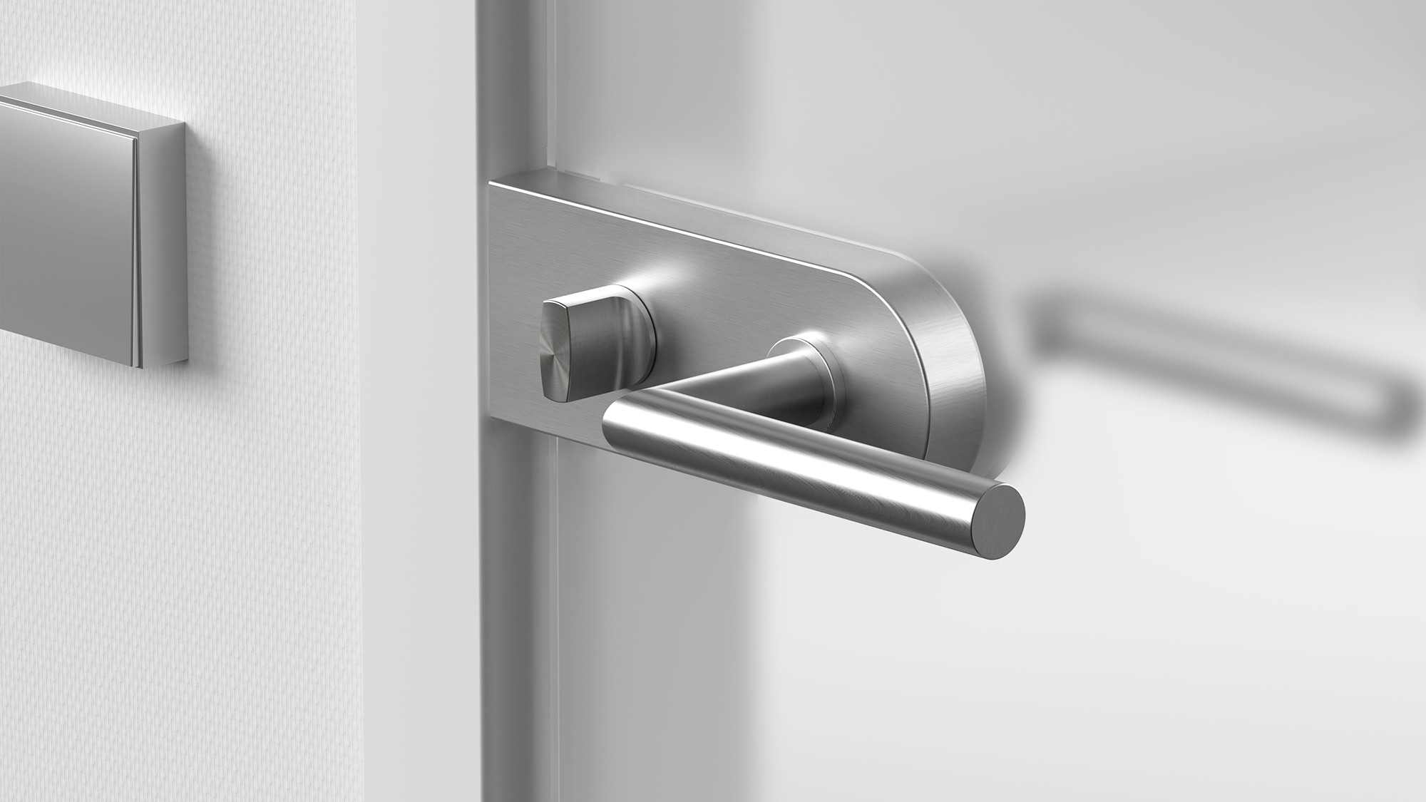
As simple as they seem, door handles serve their function very well. They can be oval, square, or any other form as long as they are recognizable in their purpose. Door handles are usually very durable, long-lasting, and yet their design is intuitive for the palm of our hand and our muscle memory. We use them so often that we rarely pay attention to their brilliance and simplicity in serving and long lasting.

On the other hand we could have automatic doors, which would seem like an improvement from a design perspective. There's nothing we need to pull or push; they open and close automatically, requiring no interaction from us except for the sensors detecting our presence.

But these advantages are outweighed by its drawbacks. Unlike a simple handle, it's heavier, more prone to mechanical failures, and vulnerable to power outages and water damage.
The takeaway from this example is that good design should be lasting and not require constant maintenance. It should serve its purpose and exist without being dependent on external factors.
Apple Airpods
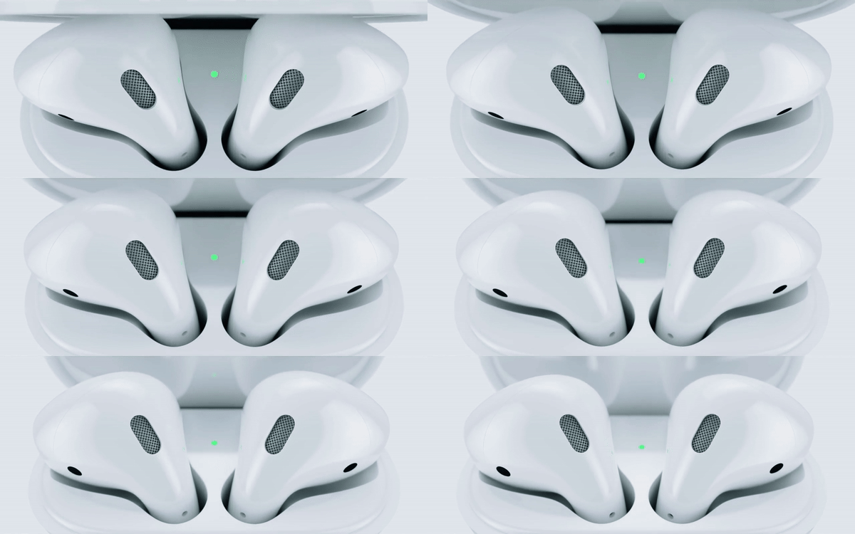
The success of AirPods lies in their ability to solve common pain points of wireless earbuds (like pairing difficulties and short battery life) while offering a seamless, intuitive user experience. They work so smoothly that users forget about the technology and just use them daily, a real example of peak invisible design in consumer electronics.
Seamless Integration that works across Apple devices.
One-step setup that automatically connects to your iPhone.
Compact Design that is lightweight and comfortable.
These are just some of the design decisions that have made AirPods a genuinely well-made product. They serve well because one of the biggest wireless headphone pain points is usually charging, it’s being resolved here by being integrated into the case itself. Putting them back in the case for a brief 5 minutes gives you around 1 hour of listening time, a feature that is often overlooked precisely because it works so well.
The takeaway of this example is that good design can be self supporting, it can leverage a functionality of one of its parts (charging case) to improve the other one (headphones) creating a symbiotic relationship between components. It produces a synergy where the whole becomes greater than the sum of its parts.
This principle of symbiotic design relationship can be applied across various fields of product design, starting from consumer electronics, furniture, automotive design, and even software interfaces. It challenges designers to think holistically about the products they create, considering how each element can support and enhance each other.
The QWERTY keyboard

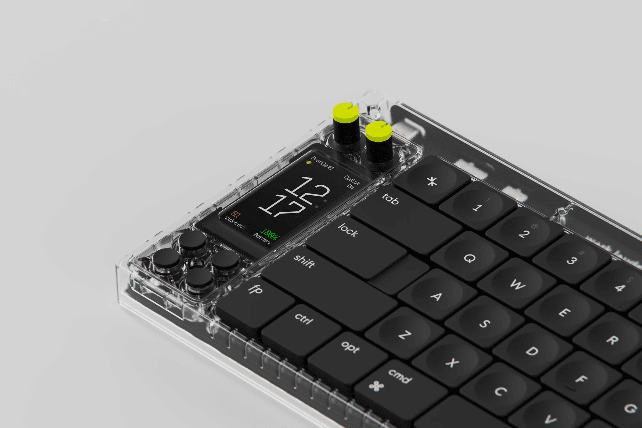
Nomad [E] keyboard by Work Louder
Most of us use keyboard daily without giving it much thought; it is another exemplary invisible design. It may seem like a random one, but this layout is the result of deliberate intent to solve a particular problem. Common letter combinations had to be separated on the old typewriters, as they would get jammed if struck quickly after one another. Although current keyboards do not have this mechanical problem, the QWERTY layout persists because of mass learning and the muscle memory created in users' minds.
It is a design so integrated into our lives that we barely even think about the thoughts behind it. The very persistence of the QWERTY layout in this day and age of touch devices shows how a good design can rise above time, how it can become a standard, and how it can shape behaviors and expectations.
The takeaway from this example is that good design can have long-lasting impacts beyond its initial intended use. It can shape habits, influence future technologies, and become so normalized that we forget it was once an innovative solution to a specific problem back then.
In essence, this approach to design doesn't just solve problems, it creates opportunities for enhanced functionality, user experience, and overall product value. It's a testament to how good design can be both invisible in its seamlessness and remarkable in its ingenuity.
Design is everywhere. It's in how we use products, how we plan our day, and how we question things from a more holistic point of view. It is life itself, where one cannot thrive without creating a value. It's the leverage of our imagination to seize every opportunity that can change not only our lives but also have the greatest impact on this world.
Sign up to get newsletter for the newest blog entries, and stuff I don't post here.

